Preparing your learning space...
100% through AI Dashboards tutorials
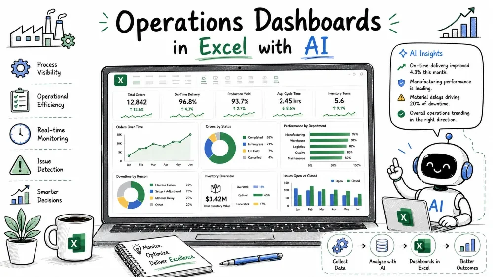
Operations dashboards watch resources and flow — stock on shelves, work in progress, and beds in use. Inventory, Project, and Hospital are grouped because all three answer the same operational question: what do we hold, what is moving, and where are we about to run out? We use the foundation method for all three.
Supply-chain leads and store managers use this to answer: How much cash is sitting on shelves? Which SKUs will stock out? It turns a stock export into a replenishment tool.
Load a table named InvData with these columns:
| Column | Example |
|---|---|
| SKU | SKU-100 |
| Product | Widget A |
| Warehouse | WH-1 |
| OpeningStock | 200 |
| Received | 50 |
| Sold | 120 |
| OnHand | 130 |
| ReorderLevel | 100 |
| UnitCost | 8 |
Ask Copilot to add a value column:
Add a column StockValue as OnHand times UnitCost.
KPI cards:
=SUM(InvData[StockValue])
=COUNTIFS(InvData[OnHand],"<"&InvData[ReorderLevel])
=SUM(InvData[Sold])/AVERAGE(InvData[OnHand])
The turnover card divides total sold by average on-hand as a simple ratio.
Copilot prompt:
Insert a column chart of stock value by warehouse from InvData.
Flag items that need replenishment:
=IF([@OnHand]<[@ReorderLevel],"Reorder","OK")
Anything below its reorder level is marked "Reorder" so buyers act fast.
Design an inventory dashboard in Excel from a table named InvData
with columns SKU, Warehouse, OnHand, ReorderLevel, UnitCost, Sold.
Give KPIs, charts, and a Copilot prompt to build it.
Top: KPI cards (Stock Value, Stockouts, Turnover). Middle: Stock-by-warehouse column + Top movers bar. Bottom: Reorder alert table. Slice by Warehouse and Product.
Project managers and steering committees use this to answer: Are we on time and on budget? Which tasks are slipping? It turns a task list into a status board.
Load a table named ProjData with these columns:
| Column | Example |
|---|---|
| ProjectID | PR-1 |
| Task | Build API |
| Owner | K. Patel |
| Start | 2026-07-01 |
| Due | 2026-07-20 |
| PctComplete | 60 |
| Status | On Track |
| Budget | 5000 |
| Spent | 3200 |
| Priority | High |
Ask Copilot to add a budget-used column:
Add a column BudgetUsedPct as Spent divided by Budget.
KPI cards:
=AVERAGE(ProjData[PctComplete])
=AVERAGE(ProjData[BudgetUsedPct])
=COUNTIFS(ProjData[Status],"Overdue")
The budget card averages the percentage Copilot computed per task.
Copilot prompt:
Insert a pie chart of task status from ProjData.
Flag late, incomplete work:
=IF(AND([@Due]<TODAY(),[@PctComplete]<100),"Overdue","OK")
A task past its due date and not at 100% is marked "Overdue."
Design a project dashboard in Excel from a table named ProjData
with columns Task, Owner, Due, PctComplete, Status, Budget, Spent.
Give KPIs, charts, and a Copilot prompt to build it.
Top: KPI cards (% Complete, Budget Used, Overdue). Middle: Status pie + Burndown line. Bottom: Budget-vs-Spent by project + Overdue table. Slice by Owner and Priority.
Hospital operations and clinical directors use this to answer: Are we over capacity? Are patients staying too long? It turns an admissions export into a capacity planner.
Load a table named HospData with these columns:
| Column | Example |
|---|---|
| PatientID | P-001 |
| Department | Cardiology |
| AdmissionDate | 2026-07-02 |
| DischargeDate | 2026-07-06 |
| Diagnosis | (text) |
| BedID | B-12 |
| Doctor | Dr. Rao |
| Cost | 4200 |
| Outcome | Discharged |
Ask Copilot to add a length-of-stay column:
Add a column LOS as DischargeDate minus AdmissionDate in days.
KPI cards:
=AVERAGE(HospData[LOS])
=COUNTA(HospData[PatientID])
=AVERAGE(HospData[Cost])
The ALOS card averages the length-of-stay column Copilot created.
Copilot prompt:
Insert a column chart of bed occupancy by department from HospData.
Flag departments near full:
=IF([@OccupancyPct]>0.9,"Full","OK")
Occupancy above 90% is marked "Full" so admins can redirect inflow.
Design a hospital operations dashboard in Excel from a table named
HospData with columns Department, AdmissionDate, DischargeDate,
BedID, Cost, Outcome. Give KPIs, charts, and a Copilot prompt.
Top: KPI cards (Occupancy, ALOS, Volume). Middle: Admissions trend + Occupancy-by-department column. Bottom: LOS-by-department bar + Capacity alert. Slice by Department and Month.
Save your progress and earn XP for completing tutorials.
4 questions · Pass with 70%+
1 When should the Inventory Reorder Alert flag an item?
2What makes a project task "Overdue" in this dashboard?
3At what Bed Occupancy % does the Hospital Capacity Alert flag a department as "Full"?
4What is the simplified Inventory Turnover ratio used in the tutorial?
Technology
Excel with AI
Lesson group
AI Dashboards
Progress
100% complete

