Preparing your learning space...
50% through AI Data Analysis tutorials
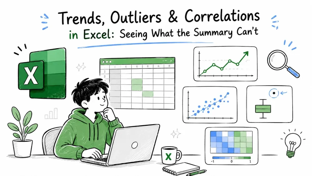
A summary tells you what's typical. These three techniques tell you what's changing, what's suspicious, and what's connected: trends over time, outliers that break the pattern, and the correlation between columns.
Trends, outliers, and correlations are three separate questions you can ask of any table:
They use the same Sales table from Tutorial 1 (Order ID in A, Date in B, Region in C, Product in D, Customer in E, Units in F, Sales in G, rows 2–16).
A trend is the underlying direction of a series once day-to-day noise is ignored. Sales might wobble week to week while still clearly growing month over month.
Select your Date and Sales columns, insert a line chart, then right-click the line and choose Add Trendline → Linear.
1. Select B1:B16 and G1:G16 (hold Ctrl)
2. Insert → Line chart
3. Right-click the line → Add Trendline → Linear
4. Check "Display Equation on chart"
A rising line means growth; a falling line means decline. The equation Excel shows (like y = 95x + 900) is the mathematical version of that trend.
A moving average replaces each value with the average of itself and the previous few values, smoothing out the wobble so the real direction becomes visible.
=AVERAGE(G2:G4)
Place this next to row 4 and copy it down. Each cell now averages three consecutive sales, ironing out the spikes. Try =AVERAGE(G2:G6) for a smoother line (a longer window) — the trade-off is that the smoothed line reacts more slowly to change.
FORECAST.LINEAR extends the trend into the future.
Syntax: =FORECAST.LINEAR(x, known_ys, known_xs)
=FORECAST.LINEAR(DATE(2026,9,1), G2:G16, B2:B16)
This estimates the sales on September 1, 2026, by continuing the linear trend from the existing dates (B2:B16) and sales (G2:G16). It's a projection, not a guarantee — good for planning, risky for promises.
Note: Ask Copilot in Excel to "show the monthly sales trend" and it will build the chart and trendline for you. If you'd rather draft it outside Excel first, paste the Date and Sales columns into ChatGPT and ask: "Plot these as a time series and tell me if the trend is up or down" — then recreate the chart in Excel. Use the manual steps when you want control over the window.
An outlier is a value that sits far outside the pattern of the rest of the data. It could be a typo (an extra zero) or a genuine exceptional event worth investigating.
The interquartile range (IQR) is the middle 50% of your data, between the first and third quartiles. The fence method flags any value that falls more than 1.5 × IQR below Q1 or above Q3.
With Copilot or ChatGPT: you don't have to write the steps by hand. In Copilot, ask "Flag sales rows that are outliers using the 1.5 × IQR rule" — it returns the flagged column. Outside Excel, paste the Sales column into ChatGPT with "Which of these values are outliers by the IQR fence method? Show the math." — useful when you want to learn the calculation before doing it in Excel.
First, get the quartiles (Q1, Q3, and the IQR respectively):
=QUARTILE.INC(G2:G16, 1)
=QUARTILE.INC(G2:G16, 3)
=QUARTILE.INC(G2:G16, 3) - QUARTILE.INC(G2:G16, 1)
Then flag each row. If Q1 is in K2, Q3 in K3, and the IQR in K4:
=IF(OR(G2 < K2 - 1.5*K4, G2 > K3 + 1.5*K4), "Outlier", "OK")
Copy this down column H. Rows marked "Outlier" are the ones worth a second look — check them against the original source before believing them.
The Z-score measures how many standard deviations a value sits from the mean. Most values fall within 3 standard deviations, so a score above 3 or below −3 is a common outlier threshold.
=STANDARDIZE(G2, AVERAGE(G$2:G$16), STDEV.P(G$2:G$16))
Copy this down. The $ signs keep the mean and standard deviation fixed while the formula copies. A value with a score above 3 or below −3 is unusually far from the pack. STDEV.P matches the choice from Tutorial 1; swap it for STDEV.S if your data is only a sample. (Prefer ChatGPT to explain a Z-score you don't trust? Paste the value, mean, and standard deviation and ask "What is this value's Z-score and is it an outlier?".)
Correlation asks whether two columns move together. Does order size rise with units bought? Does advertising spend come with higher sales?
Syntax: =CORREL(array1, array2)
=CORREL(F2:F16, G2:G16)
This measures how closely Units (F) and Sales (G) move together. The result is always between −1 and 1:
High positive or negative values mean the columns are connected; near zero means they're independent.
Select both columns and insert a scatter (X, Y) chart.
Note: Copilot can build this chart from the prompt "Create a scatter plot of Units vs Sales." If you want a second opinion on what the chart means, paste the two columns into ChatGPT and ask "Describe the correlation between these two columns in plain words."
1. Select F2:F16 and G2:G16
2. Insert → Scatter
3. Optional: right-click a point → Add Trendline to show the direction
Points forming an upward diagonal match a positive correlation; a downward diagonal matches a negative one; a scattered cloud means no relationship. The chart confirms what CORREL already told you, in a form that's easier to explain to other people.
Save your progress and earn XP for completing tutorials.
4 questions · Pass with 70%+
1A value has a Z-score of 4. What does that mean?
2Which tool extends a linear trend to estimate a future value?
3=CORREL(Units, Sales) returns 0.97. What can you conclude?
4What is the purpose of a moving average?
Technology
Excel with AI
Lesson group
AI Data Analysis
Progress
50% complete

