Preparing your learning space...
100% through AI Business Intelligence tutorials
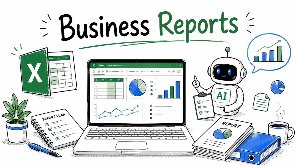
Assemble clean, decision-ready business reports — with Microsoft Copilot and ChatGPT inside every step. This tutorial covers the reporting layer: turning analyzed data into dashboards and narratives stakeholders actually read.
A business report is a structured summary of performance — numbers plus a short story of what happened and what to do. Excel holds the numbers; AI writes the story so you decide instead of type.
Why it is useful: Leaders skim. A report pairing a clear chart with a 3-line verdict gets acted on; a 20-row table gets ignored.
Use AI from the start — ChatGPT to plan the report:
"I track monthly revenue, net profit, ad spend, and new customers. Suggest a one-page business report structure with the sections and charts I should include."
ChatGPT returns a layout (KPI row, trend chart, narrative, exec summary) you build the sheet around.
Bring analyzed outputs into one tidy table — one row per period, one column per metric.
| Month | Revenue | Net Profit | Ad Spend | New Customers |
|---|---|---|---|---|
| Jan | 50000 | 18000 | 10000 | 240 |
| Feb | 55000 | 21000 | 11000 | 260 |
| Mar | 48000 | 16500 | 9500 | 210 |
| Apr | 62000 | 24000 | 12000 | 300 |
Keep it consistent — same columns every month — so charts and AI prompts reuse it.
Use AI — Microsoft Copilot to prep the data:
"From this table, add a month-over-month revenue growth % column and flag any month where new customers dropped."
Copilot computes the growth column and highlights the March dip automatically.
Before the narrative, give readers a fast visual. A PivotTable summarizes; a chart shows the trend.
Example result: April shows the highest net profit ($24,000) — the visual "peak" your report leads with.
Use AI — Microsoft Copilot to build the chart:
"Create a line chart of net profit by month and add a title and data labels."
Copilot inserts and formats the chart, sparing you the manual clicks.
Best Practice: One chart, one message. Don't stack six metrics on one axis; readers won't know what matters.
With the table and chart ready, write the report body.
Use AI — Microsoft Copilot to draft the narrative:
"Write a 4-sentence monthly business report from this table. Highlight the best month for net profit and note the trend in new customers."
Copilot returns a clean paragraph pulled from your sheet's real numbers.
Use AI — ChatGPT to tighten the draft:
"Here's my report draft: 'April net profit peaked at $24k, revenue grew 24% Jan-Apr, new customers rose to 300.' Make it punchier for a Slack update to managers."
ChatGPT condenses it into a scannable version — useful when the same finding goes to different audiences.
Common Mistake: Letting Copilot invent context ("due to seasonal demand") with no data behind it. Delete unsupported claims; keep only what the table proves.
The exec summary is the top of the report: the verdict for busy stakeholders.
Use AI — Microsoft Copilot for the summary card:
"Summarize this table's key performance into 3 bullet points for an executive audience."
Copilot produces the bullets directly from the data.
Use AI — ChatGPT for the risk-and-action frame:
"Summarize in 3 bullets for the CEO: Revenue 50k→62k Jan-Apr; net profit peaked 24k Apr; new customers to 300. Flag one risk and one action."
ChatGPT may return:
Why it is useful: ChatGPT forces the data into a decision frame — risk + action — what executives scan for.
Note: Use aggregated numbers in ChatGPT, never raw customer rows or confidential figures.
Save your progress and earn XP for completing tutorials.
4 questions · Pass with 70%+
1What is the recommended rule for a report chart?
2Before writing the narrative, the tutorial says to build a:
3Microsoft Copilot can draft the report body by:
4A good executive summary, per ChatGPT's framing, should include:
Technology
Excel with AI
Lesson group
AI Business Intelligence
Progress
100% complete

