Preparing your learning space...
100% through AI Forecasting tutorials
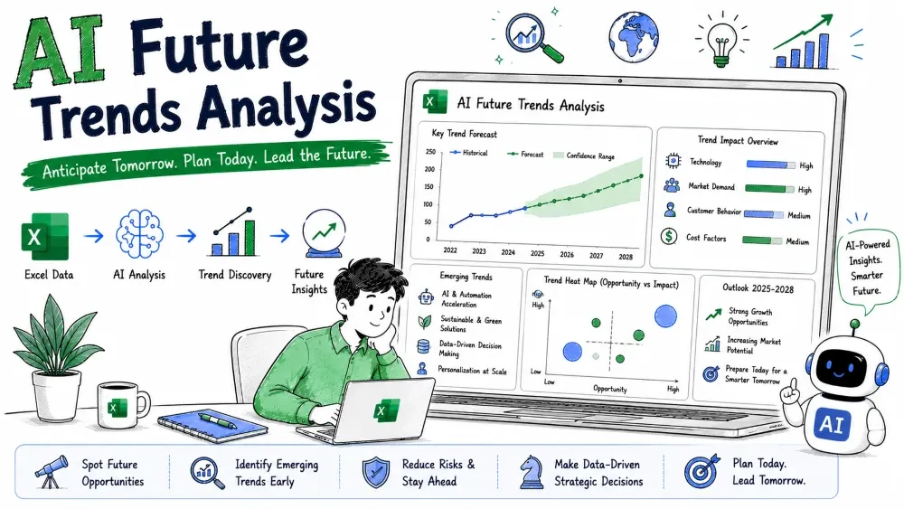
Future trends analysis looks at weak signals today — search interest, sales dips, competitor moves — to guess where things are heading. It is broader than a single forecast; it answers "what direction are we moving in?" This tutorial uses Excel charts plus ChatGPT and Microsoft Copilot to find and interpret trends.
A trend is a sustained direction in a metric over time — up, down, or shifting. Trends analysis collects several signals (your sales, web traffic, market data) and reads where each is heading to anticipate change early.
Why it matters: Catching a trend before competitors do lets you prepare — stock the rising product, fix the falling one, or enter a new market while it is still small.
Trends come from many sources in different shapes. ChatGPT can merge them into one comparable table.
Example prompt:
I have three signals for 12 months: my monthly sales, my website
sessions, and an industry index (0–100). Normalize each to a
0–100 scale using its own min/max, and output one table with
Month, Sales_N, Sessions_N, Index_N so I can chart them together.
Paste the normalized table into Excel. Putting signals on the same 0–100 scale lets you compare slopes even when the raw numbers differ wildly.
Select the normalized columns and insert a Line chart (Insert → Line). Visually, the steeper the line, the stronger the trend. For a numeric slope, add a linear trendline:
The equation y = mx + b gives you the slope m. A larger m means a faster-rising trend.
Simple explanation: The trendline fits a straight line through your points; its slope tells you, on average, how much the signal moves per month.
Best practice: Compare slopes across signals, not just levels. A signal at 40 but rising fast matters more than one at 80 but flat.
AI assist: Skip the clicks — paste the normalized numbers into ChatGPT and ask: "Run a linear regression on each signal and give me the slope per month." You get the same m values the trendline shows, as text you can drop into notes or a report.
Copilot can read the chart and state the trend in words, saving you the interpretation step.
With the chart selected, open Copilot and type:
Describe the trend in each line on this chart. Which signal is
rising fastest, and is any signal flattening or reversing?
Copilot replies in plain language — e.g., "Sessions are rising fastest; the industry index is flattening." That is your early-warning readout.
Note: Copilot summarizes what the chart shows; it does not predict. The prediction step is yours (or ChatGPT's) next.
Once you know the direction, ChatGPT helps you reason about what it means and where it ends.
Example prompt:
My normalized signals over 12 months: Sales slope +1.2/month,
Sessions slope +2.0/month, Index slope +0.4/month.
If these slopes hold for 6 more months, where does each land?
What business actions fit a rising-sessions-but-slower-sales pattern?
ChatGPT projects the endpoints and suggests the pattern means traffic is not converting — pointing you to a checkout or pricing fix rather than more ads.
Save your progress and earn XP for completing tutorials.
4 questions · Pass with 70%+
1What is a "trend" in this context?
2Why normalize signals to a 0–100 scale before charting?
3 In a linear trendline y = mx + b, what does m tell you?
4What is the common mistake in trends analysis?
Technology
Excel with AI
Lesson group
AI Forecasting
Progress
100% complete

