Preparing your learning space...
20% through AI Charts tutorials
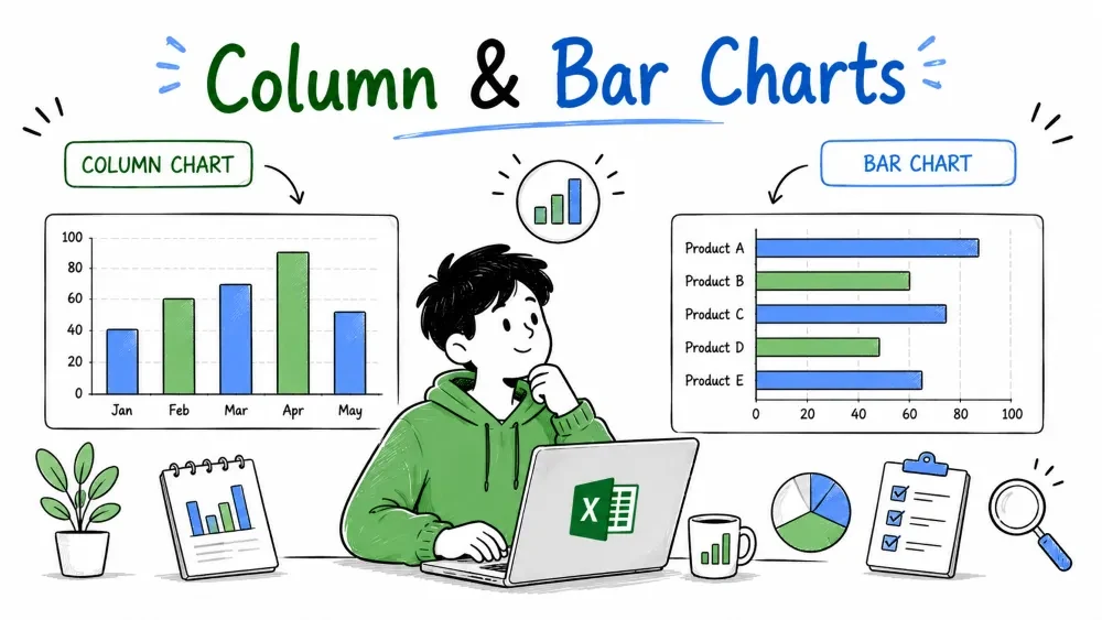
Comparing values is the most common chart request you'll make. Column and bar charts answer "how much" for each category side by side. They're the same chart — a column chart is a bar chart rotated 90 degrees — so learning both at once saves you time.
In this series we build every chart with AI — either Microsoft Copilot inside Excel or ChatGPT in your browser — so you spend your time reading the chart, not clicking through menus.
We use the same Sales table from the earlier tutorials — one row per order in A1:G16, with columns for Order ID, Date, Region, Product, Customer, Units, and Sales.
You have two AI assistants for this, and every prompt in this series works with both:
The older Analyze Data pane (Home → Analyze Data) can do much of this too, but Copilot and ChatGPT are the tools we use here — Copilot for building charts in place, ChatGPT for planning and interpreting them.
Whichever you use, the steps are the same — only the place you type changes:
The only thing that changes between tutorials is the sentence you type.
A column chart draws a vertical bar for each category, with the height showing the value. It's the default answer to "compare a few categories side by side."
Use it when you have up to about ten categories and you care about the exact size of each one — sales by region, orders per product, visits per month.
Example prompt:
Create a column chart showing total sales by region.
Copilot (or ChatGPT, if you're working externally) reads the table, groups rows by region, sums the Sales column, and returns this picture:
Region   Sales
West     3900
East     3700
South    3400
North    3130
Four columns, one per region, heights matching the totals. In one glance you see the regions are close, with West ahead. If you hover a column, Excel shows the exact value.
The columns work because there are only four categories. The moment you have dozens of categories, vertical bars stop fitting.
A bar chart is a column chart turned on its side: horizontal bars, categories down the left, values along the bottom.
Use it when you have many categories or long names. Horizontal bars grow left to right, so they keep long product names readable and stay legible when you have twenty categories instead of four.
Example prompt:
Create a bar chart of units sold by product.
This returns one horizontal bar per product:
Product   Units
Mouse     22
Monitor   14
Keyboard  13
Laptop    7
Long labels like "Keyboard" read naturally along the side, and it's easy to scan top-to-bottom to see Mouse leads. If you ask for "largest first," the longest bar sits at the top, which reads best.
Rule of thumb: short labels and few categories → column chart; long labels or many categories → bar chart. Same data, same message, different layout. Neither is more correct; the chart should simply fit the labels.
Save your progress and earn XP for completing tutorials.
4 questions · Pass with 70%+
1A column chart and a bar chart differ mainly by:
2When should you prefer a bar chart over a column chart?
3What does the prompt "sales by region" ask AI to do that "sales" does not?
4With only four regions and short names, the best chart to compare total sales is:
Technology
Excel with AI
Lesson group
AI Charts
Progress
20% complete

