Preparing your learning space...
40% through AI Charts tutorials
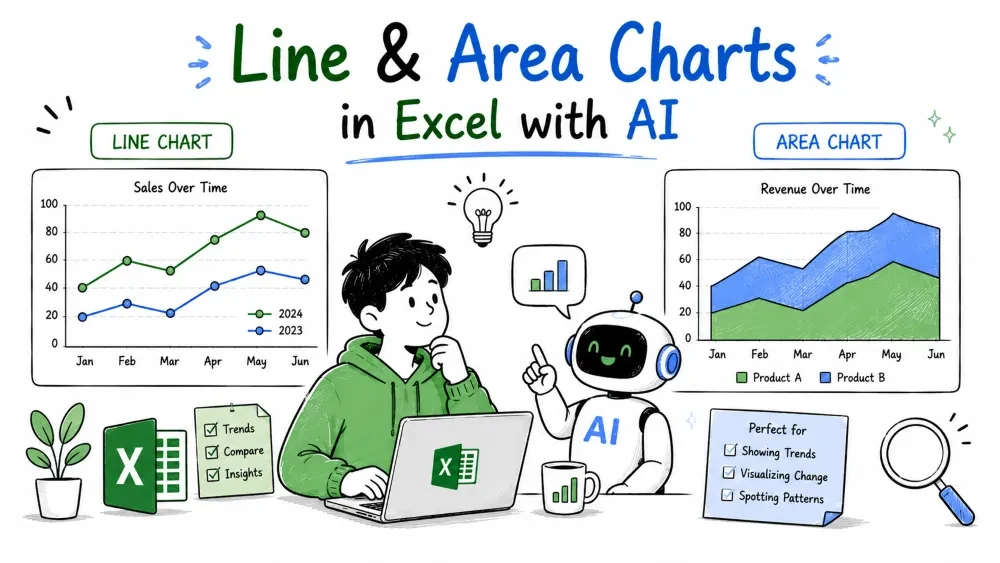
Line and area charts show how something changes over time. Both put dates on the bottom and values on the left; the area chart just fills the space under the line. They answer "what's the trend?" — up, down, or flat.
Build them with Microsoft Copilot inside Excel or ChatGPT in your browser — every prompt below works in both (see Tutorial 1 for the two routes).
A line chart connects data points in order, showing the rise and fall of a value across time. Use it whenever your horizontal axis is a date — months, weeks, quarters, years — and you want to see the trend.
Example prompt:
Create a line chart of total sales by month.
Copilot (or ChatGPT, if you're planning the chart outside Excel) groups the Sales table by month and connects the monthly totals:
Month   Sales
Jan     3000
Feb     1150
Mar     1600
Apr     3600
May     400
Jun     1680
Jul     1800
Aug     900
The line spikes in April, collapses in May, then climbs through July before easing in August. You read direction and speed instantly — a column chart gives the same numbers, but the line makes "going up or down" obvious.
Multiple lines also compare series on one chart. Ask for "sales and units by month" and each series gets its own colored line, which shows whether two measures move together or apart.
An area chart is a line chart with the space underneath filled in. It's identical for showing trends, with the extra emphasis of volume: the filled region makes the overall size of each value part of the story.
Use it when the amount matters as much as the direction — total revenue over time, or the size of inventory. A common variation is the stacked area chart, where several series stack on top of each other so the top edge shows the combined total.
Example prompt:
Create an area chart of units sold by month.
Copilot (or ChatGPT) turns the monthly unit totals into a filled region under the line:
Month   Units
Jan     4
Feb     8
Mar     11
Apr     6
May     8
Jun     13
Jul     3
Aug     3
The filled shape shows both the trend and how large each month's total is at a glance. Where a line chart emphasizes direction, the area emphasizes magnitude.
Choose the line for a clean, precise trend, especially when two or more series overlap. Choose the area when showing a single series where the bulk of the value matters. Stacked areas are for "parts making up a total over time."
Save your progress and earn XP for completing tutorials.
4 questions · Pass with 70%+
1Which chart makes an upward or downward trend easiest to see?
2An area chart is best described as:
3What happens if the date column isn't sorted old-to-new?
4When is a plain area chart a better choice than a line chart?
Technology
Excel with AI
Lesson group
AI Charts
Progress
40% complete

