Preparing your learning space...
60% through AI Charts tutorials
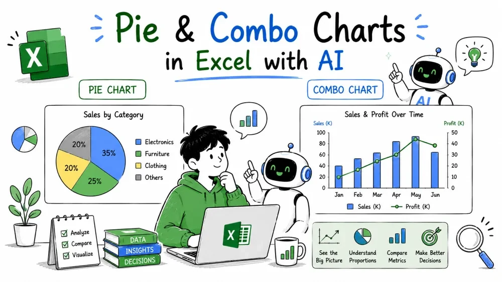
Not every chart compares or trends. A pie chart answers "what share of the total?" and a combo chart mixes two chart types to compare things with different units. Both are single, special-purpose charts.
Build them with Microsoft Copilot inside Excel or ChatGPT in your browser — every prompt below works in both (see Tutorial 1 for the two routes).
A pie chart splits a circle into slices, one per category, sized by its share of the total. Use it only when the whole really adds to 100% — revenue by region, budget by department — and you care about proportions, not exact numbers.
Example prompt:
Show sales by region as a pie chart.
Copilot (or ChatGPT, if you're working externally) turns the four regional totals into four slices, each sized by its percentage:
Region   Sales   Share
West     3900    26.6%
East     3700    25.3%
South    3400    23.2%
North    3130    21.4%
You immediately see the regions are balanced — no single slice dominates. That's the honest message of this pie. If one slice were 70%, the pie would say it loudly.
Pies fall apart when the slices get small or numerous. Two slices at 4% and 3% are hard to tell apart, and ten slices become an unreadable rainbow. The human eye is also poor at judging angles, so a pie is for "rough proportions," never for precise comparisons.
A combo chart combines two chart types in one, usually columns and a line. Its real job is comparing two measures that use different units or scales, like quantity and money.
Example prompt:
Build a combo chart: columns for units sold by month, a line for sales by month.
Units run 3 to 13, sales run 400 to 3,600. Drawn on the same scale, the unit columns would be invisible. A combo chart puts the columns on a left (primary) axis and the sales line on a right (secondary) axis:
Month   Units (left axis)   Sales (right axis)
Jan     4                   3000
Feb     8                   1150
Mar     11                  1600
Apr     6                   3600
May     8                   400
Jun     13                  1680
Jul     3                   1800
Aug     3                   900
Now both series stay visible, and you can read a useful story: sales spike in April while units stay low — a few expensive Laptops and Monitors carried the month — while May sells 8 units for just 400 (cheap Keyboards) and June moves the most units of all. A single chart type would hide one of the two trends.
Save your progress and earn XP for completing tutorials.
4 questions · Pass with 70%+
1A pie chart is appropriate when:
2What is the main limitation of a pie chart?
3What is a combo chart's real purpose?
4Without a secondary axis, what happens to a combo chart comparing units (3–13) and sales (400–3,600)?
Technology
Excel with AI
Lesson group
AI Charts
Progress
60% complete

