Preparing your learning space...
80% through AI Charts tutorials
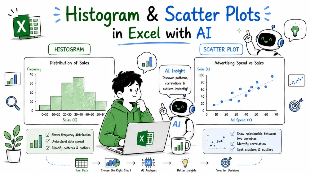
The last two chart types stop comparing categories and start asking statistical questions. A histogram shows how one column of numbers is distributed; a scatter plot shows how two columns relate to each other.
A histogram groups a single column of numbers into ranges (bins) and counts how many values fall in each range. It answers "what do the numbers look like?" — most orders small, spread evenly, or concentrated at one value.
A histogram is not a bar chart. A bar chart has one bar per category; a histogram has one bar per range of values, and the bars always touch because the ranges are continuous.
Example prompt:
Create a histogram of the Sales column.
AI splits the fifteen sale amounts into ranges and counts each:
Range of sale     Orders
0 – 500           4
500 – 1000        4
1000 – 1500       6
1500 – 2500       1
The picture shows the bulk of orders cluster at low amounts — most sales are $1,200 or less — with a single large order at $2,400. That tall bar at the common price is exactly the kind of insight a histogram is built to reveal.
A scatter plot places a point for every row, positioned by two number columns: one on the x-axis, one on the y-axis. It reveals whether two variables move together, and which rows break the pattern.
Example prompt:
Make a scatter plot of units sold on the x-axis and sales on the y-axis.
Each of the fifteen orders becomes a point:
Units   Sales
1       1200
2       600
1       1200
5       250
...     ...
12      480
Looking at the cloud of points, no clean diagonal appears. Laptops sit top-left (few units, big money) while mice and keyboards sit bottom-right (many units, little money). That scatter tells you unit count is a weak predictor of sale value — a relationship no summary table would show.
Save your progress and earn XP for completing tutorials.
4 questions · Pass with 70%+
1How is a histogram different from a bar chart?
2What question does a histogram answer?
3What does a scatter plot reveal about two numeric columns?
4What must both axes of a scatter plot be?
Technology
Excel with AI
Lesson group
AI Charts
Progress
80% complete

