Preparing your learning space...
100% through AI Charts tutorials
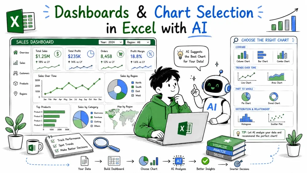
Single charts answer single questions. A dashboard answers several at once by putting the right charts on one view, and the skill that makes a dashboard readable is choosing the right chart for each question. This tutorial closes the series by covering both.
A dashboard is a single sheet (or report page) that shows several charts and key numbers together, so one look answers "how is the business doing?". The charts don't have to be new types — you reuse the column, line, pie, and the rest from this series.
Example prompt:
Build a dashboard: total sales as a big number, sales by region as a column chart, monthly sales as a line, and a pie of sales by product.
AI lays out a KPI number, the column chart, the line chart, and the pie on one view. Read left to right you get the headline (total), the balance (regions), the trend (months), and the mix (products). Four questions, one screen.
Because the charts share the same Sales table, every chart updates together when the table changes — the dashboard stays live. To filter the whole dashboard by one field, add a slicer on, say, Region; click "East" and every chart redraws for the East only.
The best chart is the one that answers the question. Match the question to the type:
| Question | Chart |
|---|---|
| How do categories compare? | Column or bar chart |
| How does a value change over time? | Line chart (area for volume) |
| What share of the whole? | Pie chart |
| Mixing two different units? | Combo chart |
| What's the distribution of values? | Histogram |
| How do two columns relate? | Scatter plot |
| Many questions at once? | Dashboard |
Keep this table in mind when you write any prompt — naming the right chart type is half the battle.
If you're unsure which chart fits, ask AI instead of guessing:
Look at the Sales table and suggest the best chart to show sales by region. Explain why.
AI answers with a recommendation and a reason — usually a column chart, because you're comparing four categories. You can go further and ask it to pick the chart itself:
Analyze the table and create the most appropriate chart for it automatically.
Use the automatic route for a quick first read, then switch to explicit types once you know the story you want to tell.
Save your progress and earn XP for completing tutorials.
4 questions · Pass with 70%+
1A dashboard is best described as:
2You want to show each region's share of total sales. Which chart matches that question?
3Why do all charts on a dashboard update together when the source table changes?
4After asking AI to "create the most appropriate chart automatically," you should:
Technology
Excel with AI
Lesson group
AI Charts
Progress
100% complete

