Preparing your learning space...
100% through AI Data Visualization tutorials
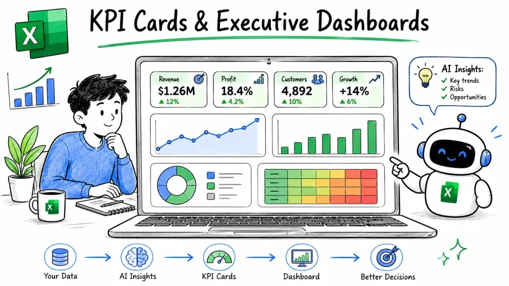
KPI cards are single-metric tiles (like "Revenue: $1.2M, ▲ 8%") and an executive dashboard is the page that arranges them with charts for a quick leadership view. This tutorial shows how to build both with AI help.
A KPI (Key Performance Indicator) card is a small visual tile showing one important number plus context — usually a comparison to a target or previous period. Think "Monthly Sales: $48K, up 12% vs last month."
A simple card is a formatted cell with a formula:
="Sales: $" & TEXT(SUM(B2:B100),"#,##0") & ", up " & TEXT((SUM(B2:B100)-SUM(C2:C100))/SUM(C2:C100),"0%") & " vs last month"
Pair it with a colored shape or a tiny sparkline (Insert → Sparklines) to show recent movement in one cell.
Select your data and prompt:
Create KPI cards for Total Sales, Average Order Value,
and Growth Rate, with a comparison to last month.
Copilot generates cards with the metrics and deltas, which you then arrange across the top of your sheet.
An executive dashboard is a single screen that combines KPI cards with a few charts (trend line, bar breakdown, maybe a heat map) so a leader understands performance in seconds. It is the output of everything in the earlier tutorials.
Keep it to one screen — scroll means it's a report, not a dashboard.
When stuck on arrangement, ask ChatGPT:
I have KPIs for sales, churn, and growth, plus a 12-month
trend and a region breakdown. How should I lay these out
on one Excel dashboard screen?
It returns a grid plan (cards on top, trend left, breakdown right) you can replicate with merged cells and chart placement.
Save your progress and earn XP for completing tutorials.
4 questions · Pass with 70%+
1A KPI card shows:
2 A typical executive dashboard layout is:
3Copilot can build KPI cards by:
4A common dashboard mistake is:
Technology
Excel with AI
Lesson group
AI Data Visualization
Progress
100% complete

