Preparing your learning space...
80% through AI Data Visualization tutorials
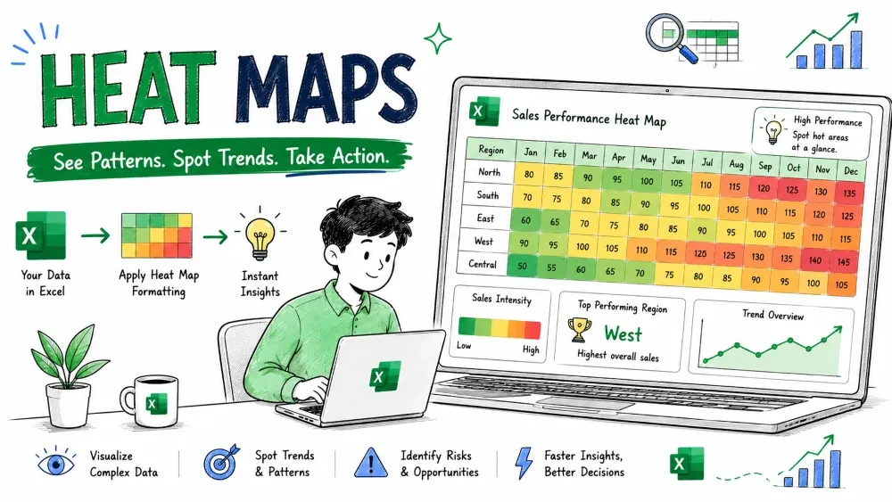
A heat map shows values as colors — dark or bright means high, light means low — so patterns jump out without reading numbers. This tutorial covers Excel conditional-formatting heat maps and how Copilot and ChatGPT can build or extend them.
A heat map is a grid where each cell's color reflects its value. It's ideal for cross-tables — like sales by region (rows) and month (columns) — where you want to spot hot and cold spots at a glance.
This needs no AI, but it's the base both assistants build on.
Select the grid and ask:
Apply a color-scale heat map to this table and highlight
the highest value in each row.
Copilot applies the scale and can add a rule for row maxima, saving you the manual formatting clicks.
Excel color scales are limited to one gradient. ChatGPT can write Python to build a labeled, annotated heat map with custom palettes — useful for reports or slides.
import pandas as pd
import seaborn as sns
import matplotlib.pyplot as plt

# df: rows = Region, columns = Month, values = Sales
sns.heatmap(df, annot=True, cmap="YlGnBu", fmt=".0f")
plt.title("Sales by Region and Month")
plt.show()
annot=True prints the number in each cell; cmap sets the color scheme. You export the image and place it in your Excel report.
Save your progress and earn XP for completing tutorials.
4 questions · Pass with 70%+
1A heat map represents values using:
2The built-in Excel way to make a heat map is:
3Copilot can help a heat map by:
4 Best practice for an accessible heat map:
Technology
Excel with AI
Lesson group
AI Data Visualization
Progress
80% complete

