Preparing your learning space...
60% through AI Data Visualization tutorials
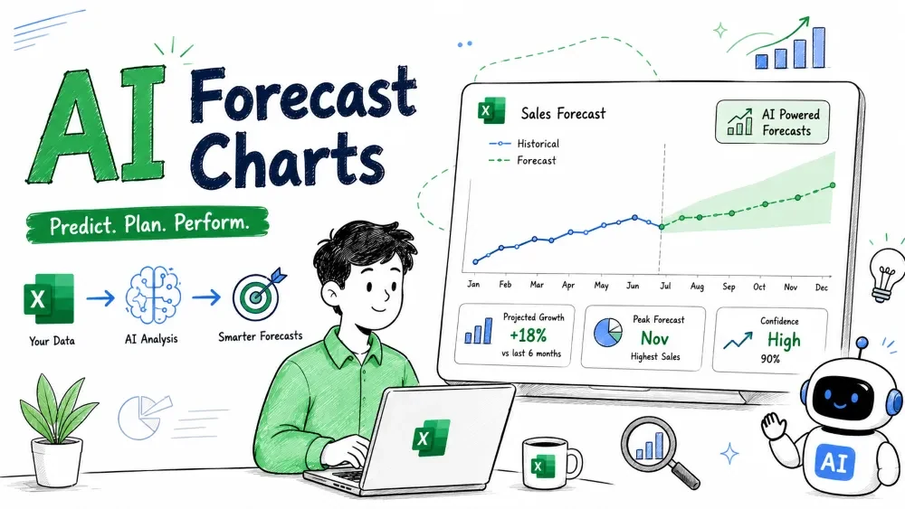
Forecast charts project your historical data into the future so you can plan instead of guess. This tutorial covers Excel's built-in Forecast tools, plus how Copilot and ChatGPT extend them.
A forecast chart plots your past values and extends a predicted line (with a confidence band) into future periods. It answers "if nothing changes, where are we headed?"
Excel does this with Forecast Sheet, which uses exponential smoothing — a method that weights recent data more heavily than old data.
Excel adds a new sheet with historical and forecast lines plus a shaded confidence interval.
With a time-series table open, ask:
Forecast next 3 months of Sales and show it as a line chart
with a confidence range.
Copilot builds the forecast using the same engine as Forecast Sheet but in conversational form, which is handy when you want it on your current sheet.
Excel's forecast is one method. ChatGPT can suggest others (linear regression, moving average, seasonal models) and write the code to run them. This matters when your data has strong seasonality Excel smooths over.
Ask ChatGPT for a seasonal forecast and it may return:
import pandas as pd
from statsmodels.tsa.holtwinters import ExponentialSmoothing

# df has columns: 'Date', 'Sales'
model = ExponentialSmoothing(
    df['Sales'], trend='add', seasonal='add', seasonal_periods=12
)
fit = model.fit()
forecast = fit.forecast(3)
print(forecast)
You run this in a notebook or Python tool, then bring the numbers back into Excel. Use this when Excel's single-line forecast feels too simple for your pattern.
Save your progress and earn XP for completing tutorials.
4 questions · Pass with 70%+
1A forecast chart primarily shows:
2Excel's Forecast Sheet uses:
3 Where do you find Forecast Sheet?
4Why might you use ChatGPT for forecasting?
Technology
Excel with AI
Lesson group
AI Data Visualization
Progress
60% complete

