Preparing your learning space...
20% through AI Data Visualization tutorials
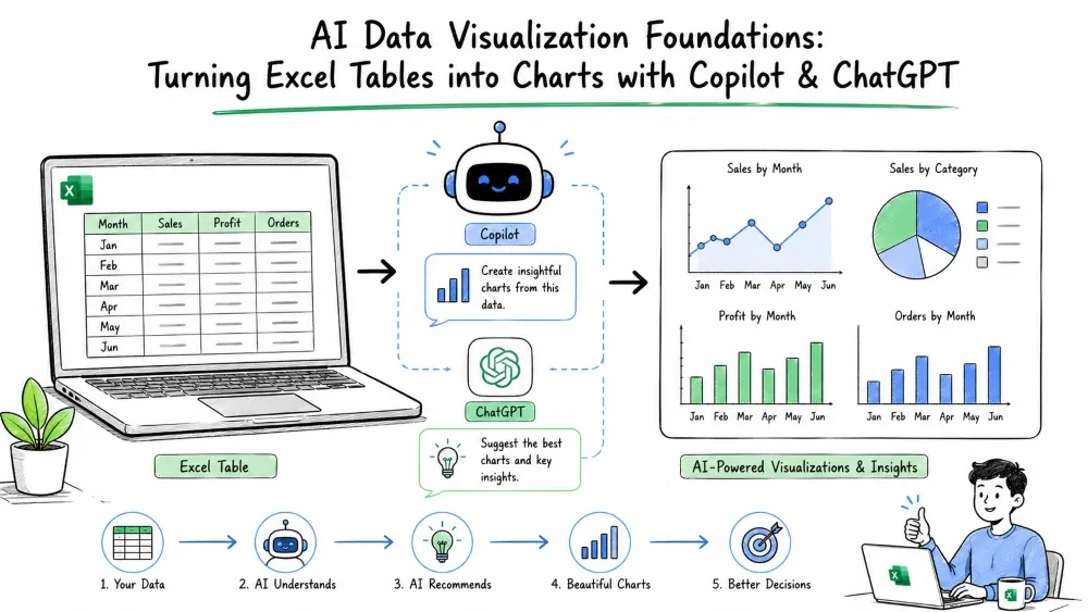
AI-powered data visualization lets you turn a plain Excel table into clear charts and dashboards by asking instead of building. This tutorial covers the tools, the workflow, and the prompt habits that make Copilot and ChatGPT useful inside Excel.
AI data visualization is the practice of using an AI assistant to suggest, generate, or refine charts from your data. Instead of manually picking chart types and formatting axes, you describe what you want in plain language.
In Excel this happens two ways: Copilot works inside your workbook, and ChatGPT works alongside it — helping you plan, write formulas, or generate chart code.
| Tool | Where it lives | Best at |
|---|---|---|
| Microsoft Copilot | Inside Excel (Microsoft 365) | Turning your open table into a chart, summarizing trends, adding formulas in-place |
| ChatGPT | Web or app, separate from Excel | Planning a dashboard, writing complex formulas, generating Python chart code, explaining results |
Rule of thumb: use Copilot when the data is already in Excel and you want speed. Use ChatGPT when you need to think through the design, write a tricky formula, or build a visual Excel can't do natively.
AI tools read your data best when it's a clean table: one header row, no blank rows, consistent formats, and a clear column for dates or categories.
Date        | Region   | Sales
2025-01-01  | North    | 1200
2025-01-01  | South    | 980
2025-02-01  | North    | 1350
Turn a normal range into a table with Ctrl + T. Copilot and Excel's chart engine both work more reliably on tables than on loose cells.
A reliable loop looks like this:
Good prompts name the goal, the columns, and the audience.
Bad:    "Make a chart of my sales."
Good:   "Create a column chart of Sales by Region from my table,
         sorted highest to lowest, for a monthly team meeting."
ChatGPT tip: paste a few sample rows and say what you're trying to show. The model then returns either a formula, a chart suggestion, or Python code you can run elsewhere.
Open your table, click Copilot in the ribbon, and type:
Show total Sales by Region as a bar chart.
Copilot inserts a chart on the sheet. Follow up with:
Add data labels and sort regions by sales descending.
You get a finished visual without touching the chart editor.
Suppose you're unsure which chart fits. Ask ChatGPT:
I have monthly sales for 5 regions over 12 months.
I want to show growth over time and compare regions.
What chart type should I use and what Excel formula
calculates month-over-month growth?
ChatGPT typically suggests a line chart for trend and gives you:
=(B2-B1)/B1
…for month-over-month growth in a column of sales, which you can fill down.
Save your progress and earn XP for completing tutorials.
4 questions · Pass with 70%+
1What is AI data visualization in the Excel context?
2When should you prefer ChatGPT over Copilot?
3 The fastest way to make a range AI-friendly is to:
4 A good prompt should name the:
Technology
Excel with AI
Lesson group
AI Data Visualization
Progress
20% complete

