Preparing your learning space...
100% through AI Formatting tutorials
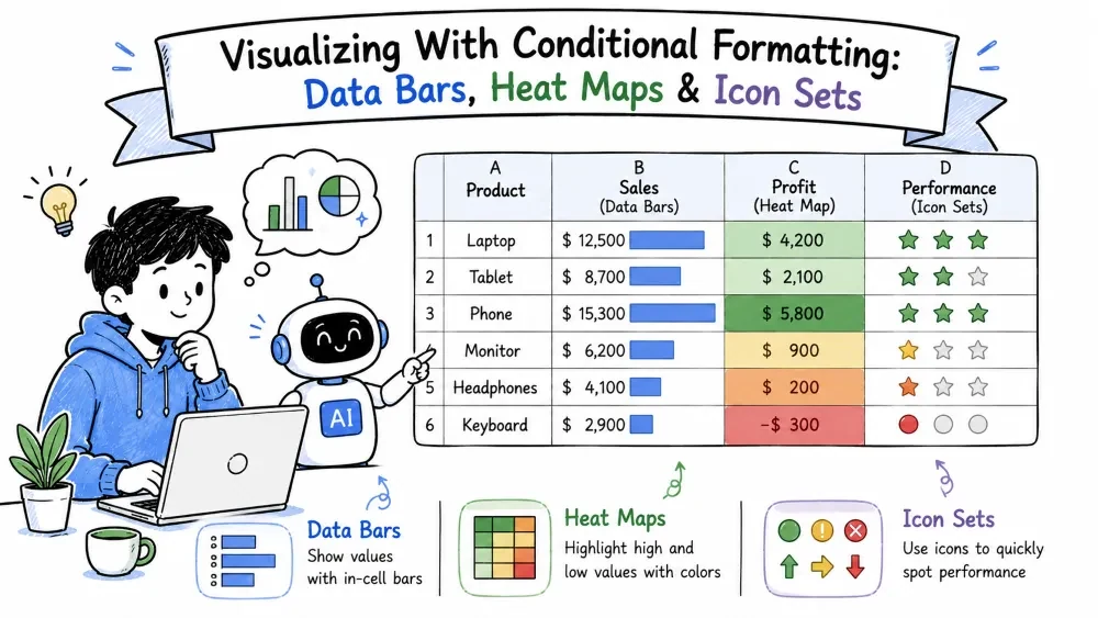
The three visualization presets of conditional formatting turn numbers into visuals inside the cell — bars, color shades, and icons. Apply them by hand or ask AI — no formulas required.
Data bars draw a bar inside each cell whose length matches the cell's value. Big number → long bar.
The bars resize live as you edit the numbers — no chart needed. For a softer look, choose a gradient fill instead of solid.
A heat map shades cells by value, from a cold color (low) to a hot one (high). Excel calls this a color scale.
Heat maps are ideal for spotting where values cluster: highest regions glow, lowest stay cool, and the whole range re-colors instantly when values change.
Icon sets replace color with symbols — arrows, traffic lights, or ratings — so meaning is readable at a glance without relying on color alone.
Higher values get one icon, mid values another, and lower values a third. This works well for status columns, since icons carry meaning even in black-and-white printouts.
| Tool | Best for |
|---|---|
| Data Bars | Comparing sizes — ranking at a glance |
| Heat Maps (Color Scales) | Spotting a pattern or trend across many values |
| Icon Sets | Status and meaning — pass/fail, growth, ratings |
You can even combine two on different columns — data bars for the amounts, icons for the status.
Ask for the visual instead of digging through menus — with Copilot or ChatGPT.
With Copilot (inside Excel):
"Add data bars to the Revenue column." "Apply a color scale to the growth numbers." "Show pass/fail icons for the Score column."
Copilot applies the visualization for you, and like any conditional rule it stays editable in the Rules Manager. Follow up with "make high values red" or "use traffic-light icons" to restyle without re-selecting your range.
With ChatGPT (outside Excel):
"Give me the Excel steps to add data bars to the Revenue column and a color scale to the growth numbers."
ChatGPT returns the exact menu paths and preset choices. You apply them in Excel — Copilot does it for you, ChatGPT tells you how.
Note: Copilot's support for specific visuals varies by Excel version — data bars and icon sets are the least likely to be available. ChatGPT works the same regardless of version, since it only writes the steps. If neither responds, the manual steps above always work.
Save your progress and earn XP for completing tutorials.
2 questions · Pass with 70%+
1Which tool draws a bar inside each cell proportional to its value?
2Which visualization shows pass/fail status without relying on color alone?
Technology
Excel with AI
Lesson group
AI Formatting
Progress
100% complete

