Preparing your learning space...
100% through AI Pivot Tables tutorials
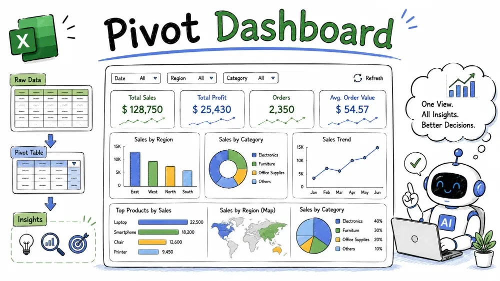
A dashboard is a single screen that answers your key questions at a glance. This tutorial brings the whole series together — pivot tables for summaries, pivot charts for visuals, and slicers for interactivity — into one clean, shared dashboard.
Before touching Excel, decide which questions the dashboard must answer. For the sample sales data, common questions are:
Map each question to a component:
| Question | Component |
|---|---|
| Total revenue today | KPI tile (number) |
| Revenue trend over months | Line pivot chart |
| Revenue by region | Bar pivot chart |
| Top products / mix | Column chart or pie |
| Filter everything | Slicers (Region, Product) |
Best practice: sketch the layout on paper first — KPIs across the top, charts in a grid below. It saves a lot of rearranging later.
A dedicated sheet keeps the dashboard clean and separate from your data and raw pivots.
Simple explanation: the dashboard sheet is just a canvas — but hiding the gridlines instantly makes it look like a real dashboard, not a spreadsheet.
Each chart needs its own pivot. You can place them on a hidden helper sheet named PivotSource so your dashboard stays clean.
Why separate pivots: one pivot powers one chart. A single overloaded pivot makes its chart cluttered and hard to read.
Now turn each pivot into a pivot chart (Tutorial 4):
Delete the pivots from the dashboard view afterward — the charts keep working because they reference the pivots on the helper sheet.
Note: if a chart suddenly looks empty, the pivot it points to may have been deleted. Keep all pivots on the helper sheet until the dashboard is final.
Interactivity comes from slicers wired across every chart (Tutorials 2 and 4):
Now one click on a region button updates every chart at once. Add a Timeline for the Date field so users can scrub through months.
Why it is useful: report connections are what make a set of charts a dashboard instead of a wall of static pictures — every element answers the same filter together.
Formatting turns functional into professional:
Common mistake: slicing only part of the charts. Test every slicer against every chart; the ones without a connection will stay static and break the illusion.
A dashboard that shows stale numbers is worse than none.
Last updated: =TODAY() so viewers know the data's age at a glance.Best practice for recurring use: consider a simple refresh macro if the dashboard is opened by less technical teammates. A one-click [Refresh All] button beats hunting through ribbon tabs.
Design a sales dashboard layout with total revenue, revenue by month, revenue by region, and top products. Give me the KPI row and chart grid as a text sketch. Use its sketch as your layout map.Add a Slicer for Region. — then still wire it to every chart with Report Connections as shown above. Type Summarize what this dashboard shows. for a quick sanity check of the totals.Save your progress and earn XP for completing tutorials.
4 questions · Pass with 70%+
1Which dashboard element answers "what is total revenue right now" at a glance?
2 What does a Last updated: =TODAY() cell on the dashboard tell viewers?
3What turns several static charts into a true interactive dashboard?
4You delete a "helper" pivot on the hidden sheet and a chart on the dashboard goes blank. Why?
Technology
Excel with AI
Lesson group
AI Pivot Tables
Progress
100% complete

