Preparing your learning space...
67% through FDE Projects tutorials
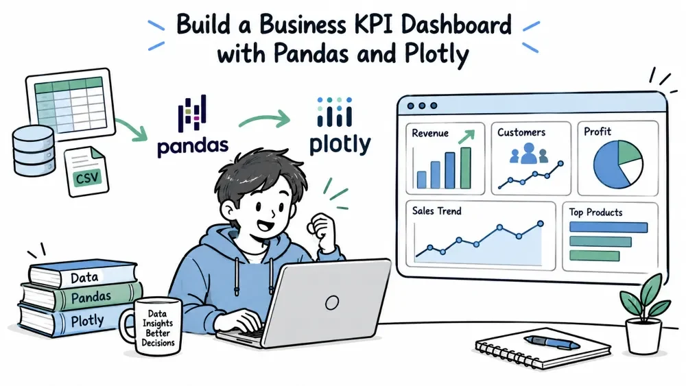
A Business KPI Dashboard takes raw business data — sales, leads, usage — and turns it into the numbers a company actually makes decisions on, laid out visually. For a Forward Deployed Engineer, KPI dashboards are how you turn a customer's pile of data into something their leadership opens every morning. This tutorial builds one with pandas for the math and Plotly for the visuals.
A dashboard is more than pretty charts. Each number on it should answer one business question — "how many new customers this month?", "what's revenue per employee?". You pick a few KPIs, compute each one from the data, and show them with a clear trend so people see movement, not just a point-in-time snapshot.
We'll use a public transactional dataset (https://raw.githubusercontent.com/.../sales.csv) modeling daily sales. The recipe stays the same for any business data.
Start by choosing the KPIs. A good KPI is measurable, tied to a business goal, and computable from data you have. Common starter set:
| KPI | Question it answers |
|---|---|
| Total revenue | How much did we sell? |
| Orders count | How many transactions happened? |
| Average order value | How big is the typical sale? |
| Revenue growth | Is business going up or down? |
Don't crowd the dashboard. Four to six meaningful KPIs beat twenty that nobody reads.
Load the data and turn the date column into a real date so you can group by week or month.
import pandas as pd

df = pd.read_csv("https://raw.githubusercontent.com/mwaskom/seaborn-data/master/tips.csv")
df["date"] = pd.date_range("2024-01-01", periods=len(df), freq="D")  # demo dates
df["revenue"] = df["total_bill"]                                     # use bill as revenue
df["date"] = pd.to_datetime(df["date"])
print(df.info())
Here tips.csv stands in for a sales table. Adding a date and a revenue column gives us a shape we can aggregate — the same transformation you'd do on a real orders table.
Use pandas aggregations to compute each KPI, and compare this period against the previous one for a growth number.
monthly = df.set_index("date").resample("ME").agg(
    revenue=("revenue", "sum"),
    orders=("total_bill", "count"),
)

monthly["avg_order"] = monthly["revenue"] / monthly["orders"]
monthly["growth"] = monthly["revenue"].pct_change().fillna(0) * 100
print(monthly.tail())
resample("ME") groups by calendar month. pct_change compares each month to the one before it — the growth KPI — and .fillna(0) clears the unavoidable NaN on the very first row, which has no previous period to compare against. Now you have one row per month with every KPI precomputed.
Plotly makes a dashboard from several charts side by side with make_subplots, or you compose them with a framework. Simplest reliable approach: individual figures.
import plotly.express as px

fig_revenue = px.line(monthly, y="revenue", title="Monthly Revenue")
fig_orders  = px.line(monthly, y="orders", title="Monthly Orders")
fig_avg     = px.bar(monthly, y="avg_order", title="Average Order Value")

for fig in (fig_revenue, fig_orders, fig_avg):
    fig.show()
Each figure opens in your browser; clicking through them gives the full dashboard. A line for trends, a bar for comparison — mixing chart types keeps it scannable. For a real deployment you'd place these in a single page (e.g., Streamlit or Dash) so they render together.
A complete dashboard pipeline as a script.
import pandas as pd
import plotly.express as px

def build_kpi_dashboard(url):
    df = pd.read_csv(url)
    df["revenue"] = df["total_bill"]
    df["date"] = pd.date_range("2024-01-01", periods=len(df), freq="D")

    monthly = df.set_index("date").resample("ME").agg(
        revenue=("revenue", "sum"),
        orders=("total_bill", "count"),
    )
    monthly["avg_order"] = monthly["revenue"] / monthly["orders"]
    monthly["growth"] = monthly["revenue"].pct_change().fillna(0) * 100

    # Headline numbers (latest month)
    latest = monthly.iloc[-1]
    print(f"Revenue ${latest['revenue']:,.0f} | Orders {latest['orders']:.0f} "
          f"| Avg order ${latest['avg_order']:.2f} | Growth {latest['growth']:.1f}%")

    # Charts
    px.line(monthly, y="revenue", title="Monthly Revenue").show()
    px.bar(monthly, y="avg_order", title="Average Order Value").show()

build_kpi_dashboard("https://raw.githubusercontent.com/mwaskom/seaborn-data/master/tips.csv")
Run it and you get the headline KPIs printed plus two charts. Swap the URL for your customer's real data and re-run — the pipeline is unchanged.
Save your progress and earn XP for completing tutorials.
4 questions · Pass with 70%+
1 What does df.set_index("date").resample("ME").agg(revenue=("revenue","sum")) do?
2Why add .fillna(0) after revenue.pct_change()?
3 Which is the best practice for choosing KPIs?
4 How is "average order value" computed here from monthly data?
Technology
Forward Deployed Engineer
Lesson group
FDE Projects
Progress
67% complete

