Preparing your learning space...
29% through Solution Design tutorials
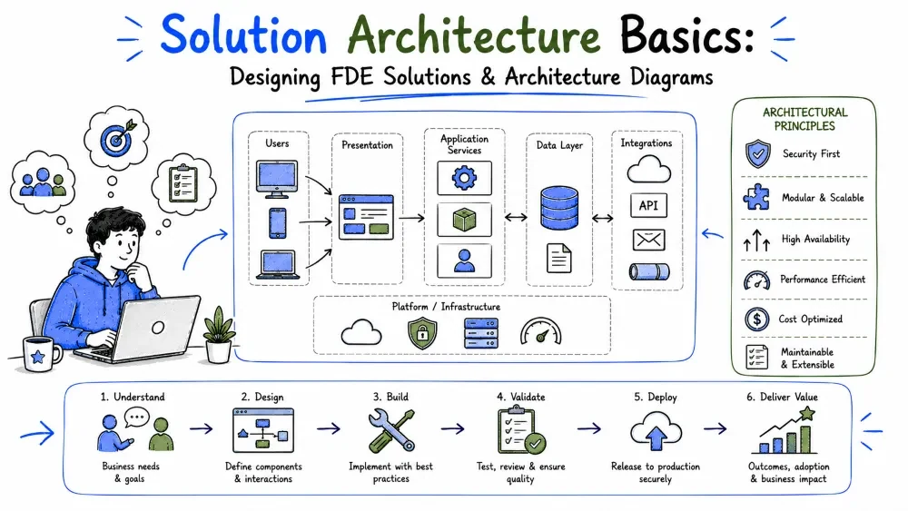
Architecture is the shape of a solution: what the pieces are, what each piece does, and how they talk to each other. This tutorial covers the vocabulary and patterns every solution is built from, shows how an FDE applies them under real engagement constraints, and finishes with the diagrams you'll use to think, present, and get the design approved.
Solution architecture is the high-level structure of a system: its components, their responsibilities, and the connections between them. It answers questions like "where does the data live?", "what handles the requests?", and "what happens when something fails?" — before anyone writes code.
Architecture is not code. It's the set of decisions that are expensive to change later. Picking the wrong button color is a fix; picking the wrong database for your access patterns is a rebuild.
Why it matters: every hour spent on a bad structure multiplies into days of rework. A small amount of upfront design is the cheapest insurance in software.
Strip away the buzzwords and every solution is assembled from the same six kinds of pieces:
| Block | Job | Everyday examples |
|---|---|---|
| Client / Frontend | What users see and touch | Web app, mobile app, internal dashboard |
| Backend / Services | Business logic and rules | API server, worker service |
| Data store | Keeps the data | SQL database, object storage, cache |
| Integration | Connects to outside systems | API calls, webhooks, sync jobs |
| Infrastructure | Where everything runs | Cloud VMs, containers, serverless |
| Cross-cutting concerns | Needed everywhere | Auth, logging, monitoring |
A useful mental model: data flows in one direction through these blocks — from the user, through services, into storage, and back. Most architecture work is deciding what each arrow looks like.
You'll meet four styles constantly. Each is a different answer to "how do we split up the work?"
Monolith — one application does everything.
[ Web UI + Business Logic + Data Access ] → [ Database ]
Simple to build, deploy, and debug. The right default for most FDE projects.
Client–Server / API-based — a frontend talks to a backend over HTTP.
[ Web / Mobile App ] ⇄ [ REST API ] ⇄ [ Database ]
The standard shape for anything with multiple client types or external integrations.
Microservices — many small services, each owning one job.
[ Orders service ] [ Billing service ] [ Notifications ]
        ↘                ↓                ↙
              [ message bus / APIs ]
Powerful at scale, expensive in complexity. Rarely justified for a single-customer build.
Event-driven — components react to events instead of calling each other directly.
[ Order placed ] → event bus → [ inventory updates ]
                              → [ email sends ]
                              → [ analytics records ]
Great for decoupling steps that don't need to happen at the same instant.
Note: these styles mix. A monolith with one event-driven pipeline is normal and healthy. Pick per problem, not per ideology.
Every architecture choice buys something and pays for something. There are no free lunches — only trade-offs you make consciously or by accident.
| Decision | You gain | You pay |
|---|---|---|
| Monolith over microservices | Simplicity, speed | Harder to scale one piece alone |
| Managed cloud service | Less ops work | Cost, vendor lock-in |
| Queue between steps | Reliability, decoupling | Latency, more moving parts |
| Caching | Speed | Stale-data bugs |
The professional move is stating the trade-off out loud: "We're using a queue here, which adds ~2 seconds of latency, so that a slow email provider can never block order confirmation."
Best Practice: when two designs both work, choose the boring one. Proven technology with a known failure mode beats clever technology every time in a customer engagement.
An FDE designs under constraints a platform team never faces:
These constraints point to a consistent FDE design philosophy: reuse before you build, configure before you code, and keep the architecture small enough to hold in one head.
The logistics case from Tutorial 1: drivers confirm deliveries on phones, the office sees status live, nothing is lost in dead zones, only dispatchers reassign, and volume triples at holidays.
Designing it step by step:
[ Driver phone app ]          [ Dispatcher dashboard ]
   (offline queue)                 (web app)
        │  syncs when online            │
        ▼                              ▼
[ Sync API ] ──────────────► [ Delivery service (monolith) ]
        │                              │
        ▼                              ▼
[ Deliveries DB ]            [ Roles & access control ]
        │
        ▼
[ Sync job → customer's ERP ]   (existing system — integrate, don't replace)
The decisions, with their trade-offs stated:
| Decision | Why | Trade-off accepted |
|---|---|---|
| Monolith, not microservices | One developer, weeks of runway | Can't scale pieces independently — fine at this volume |
| Offline queue on the phone | Dead-zone requirement | Sync conflicts to resolve; keep confirmations append-only to avoid them |
| Scheduled sync to ERP, not a rebuild | ERP exists and works; invoicing runs daily, so real-time isn't needed | We depend on their API's uptime; add retries |
| Managed cloud hosting | No ops team | Monthly cost; acceptable vs. hiring |
Read the diagram and you can see the philosophy: one service, one database, integration instead of replacement, and complexity only where a requirement forced it.
A design only becomes real when someone else can see it. Diagrams do three jobs that text can't:
Best Practice: draw before you build. A diagram made during design is a thinking tool; a diagram made after launch is archaeology.
You don't need the full UML catalog. Four types cover nearly every FDE situation:
| Type | Answers | Use when |
|---|---|---|
| Component diagram | What are the pieces? | Presenting the overall solution shape |
| Data flow diagram | Where does data move? | Designing integrations and pipelines |
| Sequence diagram | What happens in what order? | Working out one interaction in detail |
| Deployment diagram | Where does it run? | Planning hosting, networks, environments |
Each one zooms into a different question. A good solution document has one of each, at most.
Component diagrams show the system's pieces and who talks to whom. Boxes are components; arrows are communication.
┌──────────────┐        ┌──────────────────┐        ┌──────────────┐
│  Mobile App  │───────▶│   Delivery API   │───────▶│ Deliveries DB│
└──────────────┘        └────────┬─────────┘        └──────────────┘
                                 │
                                 ▼
                        ┌──────────────────┐
                        │  Customer's ERP  │
                        └──────────────────┘
Name boxes by their job ("Delivery API"), not their technology ("Node server") — technology changes, jobs don't. Show only components that matter to the question being asked, and group related boxes inside a bigger box to show boundaries ("Customer's network", "Our cloud").
Data flow diagrams follow one thing: the data. Every arrow is labeled with what moves.
[Driver confirms] ──confirmation──▶ [Sync API] ──record──▶ [Deliveries DB]
                                        │
                                        ├──records──▶ [ERP sync job]
                                        │
                                        └──status──▶ [Office dashboard]
The discipline: label every arrow with the data it carries. Unlabeled arrows are where misunderstandings hide — "what exactly flows there?" is the question you want answered on paper, not in production. This is the best diagram type for integration design, because it forces you to name every handoff between systems.
Sequence diagrams show one scenario as a timeline of calls, read top to bottom. Each column is a participant.
Driver App  Sync API  Deliveries DB      ERP
   │              │                 │               │
   │── confirm ─────▶               │               │
   │              │── save ────────▶│               │
   │              │◀── ok ──────────│               │
   │◀── 200 OK ──────               │               │
   │              │── sync ────────────────────────▶│
   │              │◀── ack ─────────────────────────│
Use a sequence diagram when order matters: logins, payment flows, sync processes, anything with retries or timeouts. It's the only diagram type that shows time — and it's where you find the awkward questions ("what if the ERP doesn't answer?"). Draw the failure path too, or at least mark where it goes.
Deployment diagrams show where software physically runs: servers, clouds, networks, and the boundaries between them.
┌─────────── Customer network ───────────┐   ┌──────── Cloud ────────┐
│  [ Office dashboard ]  [ ERP server ]  │◀─▶│  [ API ]  [ Database ]│
└────────────────────────────────────────┘   └───────────────────────┘
              ▲
              │ internet
        [ Driver phones ]
This is the diagram for security and IT conversations: it shows what sits inside the customer's firewall, what sits in your cloud, and which arrows cross the boundary — exactly what their IT team will ask about.
Arrows carry most of a diagram's meaning, and most bad diagrams are bad because of sloppy arrows.
| Arrow style | Convention |
|---|---|
Solid arrow ──▶ | A request or data push ("calls", "sends") |
Dashed arrow ╌╌▶ | A response or async event ("returns", "notifies") |
Double arrow ◀──▶ | Two-way communication |
| Labeled arrow | Always: what flows, and in what format if it matters |
Two habits that prevent confusion:
For anything that lives in documentation, write diagrams as text with Mermaid — it renders in GitHub, GitLab, Notion, and VS Code, and you can edit it like code.
flowchart LR
    A[Mobile App] -->|confirmations| B[Sync API]
    B --> C[(Deliveries DB)]
    B -->|sync| D[Customer ERP]
    B -->|status| E[Office Dashboard]
The same diagram as plain text:
flowchart LR
    A[Mobile App] -->|confirmations| B[Sync API]
    B --> C[(Deliveries DB)]
    B -->|webhook| D[Customer ERP]
    B -->|status| E[Office Dashboard]
Why text diagrams win in FDE work: they live in the repo, they get reviewed in pull requests, and updating one takes seconds. Save the drag-and-drop tools for the big presentation diagram.
Save your progress and earn XP for completing tutorials.
4 questions · Pass with 70%+
1Which architecture style is identified as the "right default for most FDE projects"?
2In the "Common Architecture Styles" table, what does the microservices diagram show?
3What does the tutorial warn about when combining architecture styles?
4What is the primary purpose of a deployment diagram?
Technology
Forward Deployed Engineer
Lesson group
Solution Design
Progress
29% complete

