Preparing your learning space...
33% through AI Pivot Tables tutorials
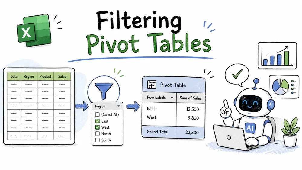
A pivot can show too much. Filtering focuses it on exactly what matters — one region, a date range, a category. This tutorial covers dropdown filters, Report Filters, Slicers, Timeline filters, and hooking them together.
Every row and column field in a pivot has a small drop-down arrow on its header.
You can also use the Search box inside that list to find items quickly — useful when the field has dozens of values.
Simple explanation: this is the same checkbox filter you already know from Excel tables — applied to the pivot's labels.
A Report Filter adds a dropdown above the pivot that filters the entire summary at once.
Report Filters are great when you want one visible control that changes everything, but they are less user-friendly than Slicers for dashboards.
Sometimes you don't want to pick specific items — you want the best ones.
You can also use Text Filters (Contains, Begins with) and Date Filters (This Month, Last Quarter) the same way.
A Slicer is a floating panel of filter buttons — one button per value.
A panel of buttons appears. Click a region button to filter the pivot to that region:
Why slicers are useful: they show the user what is available and what's selected, at a glance. That makes them the standard filter tool on dashboards. You can restyle them from the Slicer tab with preset colors.
A Timeline filters by dates — ideal for sales data.
A date bar appears. Click a month button to filter to that month, or drag the selection markers to choose a range of months. Excel auto-suggests Month / Quarter / Year levels you can switch between.
Note: a Timeline only works with a real date column. Text dates need to be converted to true Excel dates first.
One slicer can drive several pivots at once, so a dashboard stays in sync.
Now selecting a region in the slicer updates all connected pivots together. This only works when the pivots share the same underlying source data.
Add a Slicer for Region and a Timeline for Date. Copilot inserts both controls. A follow-up like Filter to the North region only narrows the pivot on command.My pivot has Region, Product, Category, Date, Revenue. Which should be Slicers, which a Report Filter, and which a Timeline on a dashboard? Why? Use its reasoning to lay out your controls — then wire them together with Report Connections.Save your progress and earn XP for completing tutorials.
4 questions · Pass with 70%+
1You want to see only the 5 best-selling products. Which tool?
2You connected a Slicer to two pivots, but one ignores it. Most likely reason?
3Where does a Report Filter control appear?
4What's the fastest way to clear a Slicer's filter?
Technology
Excel with AI
Lesson group
AI Pivot Tables
Progress
33% complete

