Preparing your learning space...
67% through AI Pivot Tables tutorials
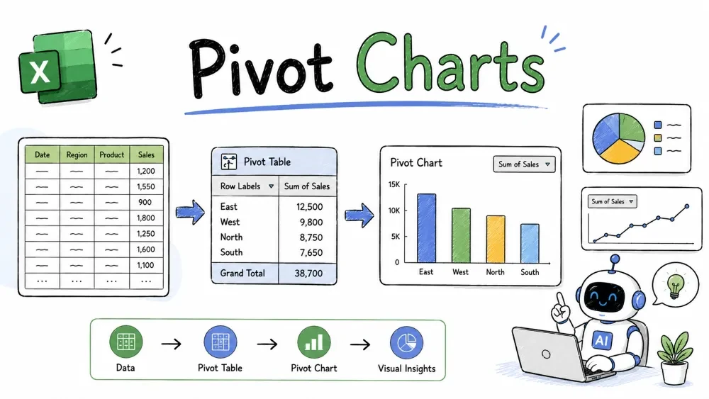
A pivot chart is a chart built directly from your pivot table — and the two stay in sync. Change the pivot and the chart changes; filter the chart and the pivot filters too. This tutorial covers creating, choosing, and controlling pivot charts.
A pivot chart is a chart that reads from a pivot table instead of from raw cells. Because of that link, every summary your pivot shows is mirrored in the chart automatically.
Why it is useful: you get both a number summary and a picture of it with zero extra work. Drag fields in the pivot and the chart redraws itself.
A chart appears next to your pivot, and a PivotChart Fields pane opens on the right — it looks exactly like the pivot's field pane.
Simple explanation: the chart and the pivot share the same field layout. Rows in the pivot become the chart's categories; Values become the bars or lines.
| Chart type | Best for |
|---|---|
| Column / Bar | Comparing categories (revenue per region) |
| Line | Trends over time (revenue per month) |
| Pie / Doughnut | One dimension's share of the total (sales mix by product) |
| Stacked Column | Category breakdown within totals |
For the sample sales data, a Line chart on monthly revenue shows the trend clearly, while a Column chart on region revenue compares regions.
Note: pie charts only handle a single data series. If your pivot has both categories and months, switch to a column or line chart instead.
Best practice: remove gridlines and heavy borders on dashboard charts. Clean charts read faster.
Because chart and pivot are linked, you can filter from either side:
This two-way link is what makes pivot charts feel "live."
Slicers (from Tutorial 2) work directly on charts:
The chart redraws instantly for the selected region. This is the building block of an interactive dashboard.
| Regular chart | Pivot chart | |
|---|---|---|
| Data source | Cell references | The pivot table |
| Updates | You edit references | Pivot-driven, auto-sync |
| Filters | Manual per-point | Uses pivot filters/slicers |
| If pivot is deleted | Unaffected | Chart breaks |
Common mistake: deleting the pivot because you "only need the chart." The pivot chart depends on it and will vanish. If you want a standalone picture, copy the chart with Paste Special → Picture or rebuild it as a regular chart.
Create a line chart of revenue by month. Copilot builds a chart linked to your pivot. Follow up with Make it a column chart. to change the type.My pivot has Date and Revenue. Which chart best shows the trend over months, and which best compares regions? for a fast, explained choice — or Write the steps to change a pivot chart from column to line in Excel. for step-by-step.AI picks the chart and writes the steps, but you still choose the story it tells: a line for trends, a column for comparisons.
Save your progress and earn XP for completing tutorials.
4 questions · Pass with 70%+
1A pie chart is generally unsuitable when your pivot has both months and categories because:
2The funnel (Chart Filters) button at a chart's top-right does what?
3A stacked column chart is best at showing:
4You want a standalone picture of a chart that survives deleting the pivot. Do what?
Technology
Excel with AI
Lesson group
AI Pivot Tables
Progress
67% complete

