Preparing your learning space...
60% through Prompt Engineering for Excel tutorials
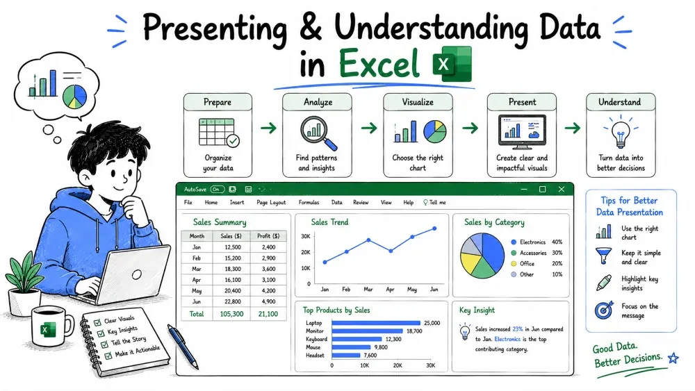
These prompts make your data speak. Analysis prompts tell you what the numbers mean; chart prompts turn findings into pictures anyone can read. This tutorial covers asking the AI to summarize, compare, and explain your data — then building the chart that shows the story.
This tutorial is written for Excel with AI — the example prompts below are things you type into an AI assistant such as Microsoft 365 Copilot in Excel or ChatGPT.
Two ways to send these prompts:
The prompting skills are the same either way — only how the AI reaches your data changes.
Analysis prompts ask the AI to interpret your data; chart prompts ask it to visualize it. One returns understanding, the other returns a picture. Used together — understand first, then present — they turn a plain spreadsheet into a story anyone can follow.
The order matters. You should know what the data says before you chart it, or you risk visualizing a pattern that is not there. So this tutorial covers analysis first, then charting.
Example — the two kinds of prompt:
| Prompt | What it returns |
|---|---|
| "Which month had the highest sales, and why?" | An interpretation with reasoning. |
| "Chart sales by month as a line chart." | A visualization of the data. |
Explanation: the analysis prompt tells you the meaning; the chart prompt shows it. A typical workflow runs the analysis prompt first, then charts whatever it found.
Start almost every analysis by asking for the big picture. A summary gives you an overview before you dig into details.
What a good summary request gives you:
Give me a one-paragraph summary of this sales table: total
revenue, total units, average order value, and the single
biggest driver of revenue.
Explanation: the request defined the scope (a paragraph) and the exact metrics. The AI reports the headline numbers and names the biggest driver, so you have context before asking anything deeper.
Best Practice: summarize before comparing. If you ask for the best region before understanding the data, you may get an answer without knowing whether it is statistically meaningful.
Once you know the overview, start comparing. Comparison prompts answer "which one is ahead, and by how much?"
Example:
Compare revenue across all regions. Rank them best to worst,
and show each region's share of total revenue as a percentage.
Explanation: the prompt asked for a ranking and a share of total. The output is a small table — region, revenue, share — that positions every region relative to the others at a glance.
Best Practice: state the comparison's basis. "Compare by revenue", "compare by growth rate", or "compare by profit margin" produce very different answers.
Ask the AI to look for trends over time and patterns that are not obvious. These prompts turn raw data into a story.
Example:
Look at revenue over the last 12 months. Is there an upward
or downward trend? Are there any seasonal patterns — months
that consistently repeat higher or lower?
Explanation: the AI looks across the timeline and reports direction and seasonality. This is the difference between "here are 12 numbers" and "here is the pattern in those 12 numbers."
Note: trends are only trustworthy if your data has enough history. A single month or a bumpy series does not prove a season. Ask the AI to note how confident it is.
The most valuable analysis prompts are the ones that ask why. A "why" prompt connects a number to its cause, which is where real insight lives.
Sales jumped 40% in March and then fell back. What could
explain that spike? Look at the columns for product, quantity,
and unit price for any clue.
Explanation: the prompt points the AI at the candidate columns. It can then hypothesize — a big one-off order, a price change, a new product launch — and tell you where to look. The AI is giving hypotheses to verify, not guaranteed answers.
Best Practice: treat "why" answers as leads, not facts. The AI can only see the data you gave it; it cannot know about a marketing campaign that your sheet never recorded.
Chart type is the clearest way to control a chart. Each type makes a different point, so say the one you want.
When to use each:
Example — same data, different chart:
Sales by month as a column chart.
Column chart of A2:A12 (months) against E2:E12 (revenue)
Sales by month as a line chart.
Line chart of A2:A12 (months) against E2:E12 (revenue)
Explanation: you told the AI the shape you wanted. Both requests used the same data but produced different chart types, because the prompt named them.
Best Practice: if you know you want a line, say "line chart." Do not describe it ("a chart where the points go up and down") — name it.
The AI needs to know exactly which columns to plot and on which axis. State the categories (usually the X axis) and the values (usually the Y axis).
Make a bar chart with Region (column B) on the X axis and
average Order Value (column D) on the Y axis, all rows.
Explanation: the prompt gave both axes by name, so the AI knows Region is the category and Order Value is the value. Without this, it picks the first two numeric columns it finds.
Best Practice: mention how many series you want. "Plot Revenue and Profit as two lines" prevents the AI from plotting only one.
Charts should be readable on their own. Ask the AI to add a title, label the axes, and keep the legend clear — or to remove a legend you do not need.
Create a line chart of revenue by month. Add a title "Revenue
Trend 2025", label the X axis "Month", the Y axis "Revenue ($)",
and show a legend only if there is more than one series.
Explanation: every instruction is concrete — what the title says, what the axes say, and when the legend should appear. The result is a chart you can drop straight into a report.
Styling covers colors, fonts, and how much clutter appears. Keep it light, but if your chart must match a presentation theme, say so.
Common styling prompts:
Chart revenue by region as a bar chart. Remove gridlines,
show each bar's value on top, and highlight the highest bar
in a contrasting color.
Explanation: the AI flags the tallest bar, labels the values, and drops the gridlines. Small styling requests make a generic chart look deliberate.
Note: AI tools vary in how much styling they can actually apply. If the tool only returns steps, follow them; if it builds the chart directly, the styling turns into settings.
Not sure which chart fits your data? Ask the AI to recommend one and explain why. This is the "analysis of charts" skill — choosing the right visual.
I have three columns: Month, Revenue, and Marketing Spend.
I want to show whether marketing spend is connected to revenue.
Which chart type should I use and why?
Explanation: the AI will suggest a scatter plot (to show the relationship) and explain why a line chart would mislead here. Letting the AI justify its choice teaches you chart selection rather than just producing a chart.
End an analysis by asking what to do. Recommendation prompts turn understanding into a next action.
Based on this data, which product should we focus on next
quarter? Give your reasoning in two or three bullet points.
Explanation: the AI weighs the data — likely the highest-growth or highest-margin product — and explains its choice. Recommendations are only as good as the data behind them, so always read the reasoning, not just the pick.
Example:
Our Chai sales are high but margins are thin. Recommend one
action to improve profitability, with the reasoning.
Explanation: the prompt supplies a known constraint (thin margins) so the AI does not repeat advice you already heard. Good recommendation prompts give the context the AI needs to add value.
Save your progress and earn XP for completing tutorials.
3 questions · Pass with 70%+
1Which chart type best shows change over time?
2Before comparing regions in depth, what should a good analysis prompt do first?
3To show whether marketing spend and revenue are related, the AI should recommend which chart?
Technology
Excel with AI
Lesson group
Prompt Engineering for Excel
Progress
60% complete

